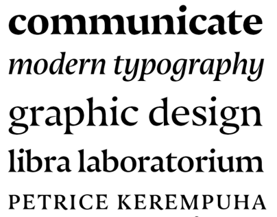

Nocturno, the branch of the series optimized for text, is unquestionably calligraphic; apart from tall lowercase letterforms, short ascenders and descenders, an oblique axis (e.g., the canted interior of o) and medium contrast, it features wide and rather hefty concave slab serifs, soft, elongated teardrop terminals (e.g., c, f, r), and slanted top serifs (e.g., h, k, m). The roundness of b, c, o, and p is reiterated by the recurvate inside contours of h, m, and n which not only facilitates reading but also enhances the letterforms' connectedness and rightward drag. Nocturno's open, efficient proportions and flowing italics make for an especially legible text face with sufficient contrast of slope, shape, width, and weights to establish clear hierarchies. Its carefully tuned weights – Regular, Book, Medium, and Bold – also make it possible to harmoniously set lines of positive and negative text.


