


When looking at your achievements so far — which of your fonts are you happiest with?
I like almost all of them, although I have recurring doubts about my earliest releases and would perhaps prefer to take them out of the program — which takes us back to the subject of premature releases.
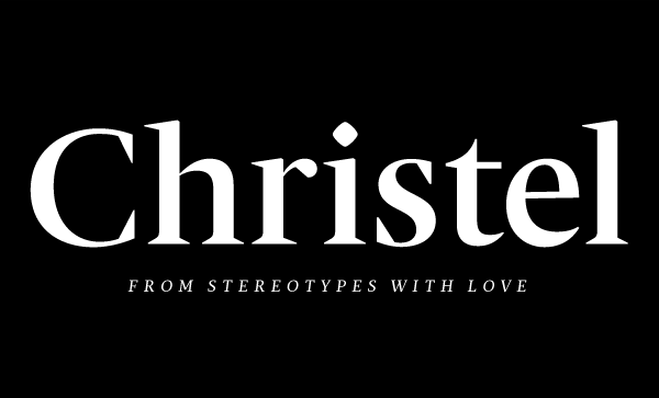
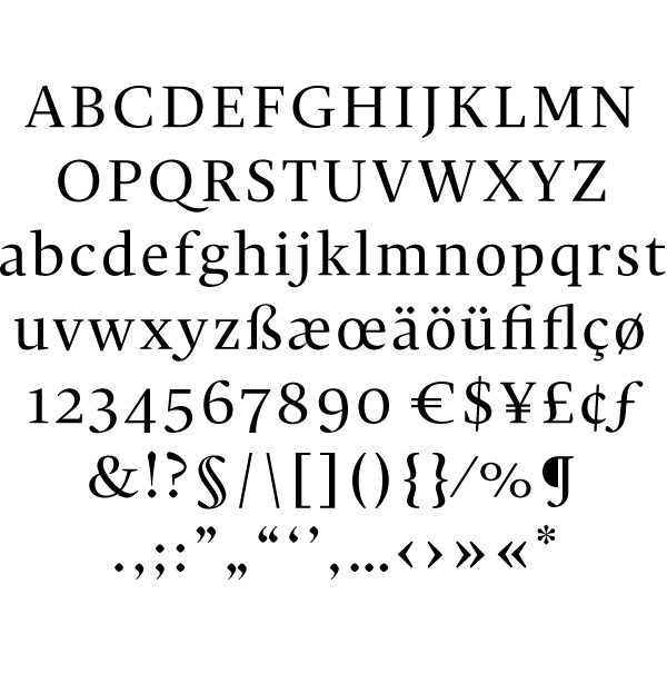
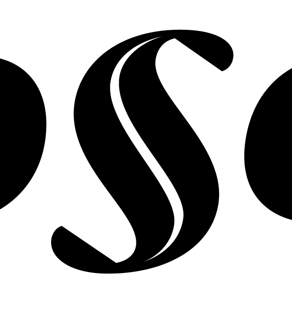
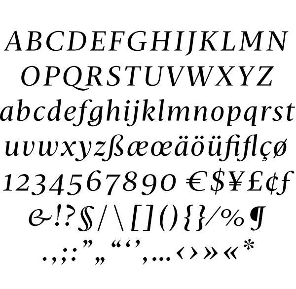
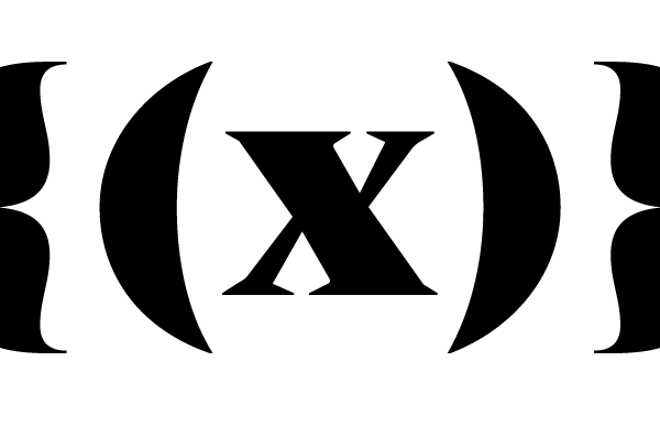
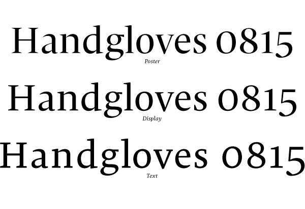
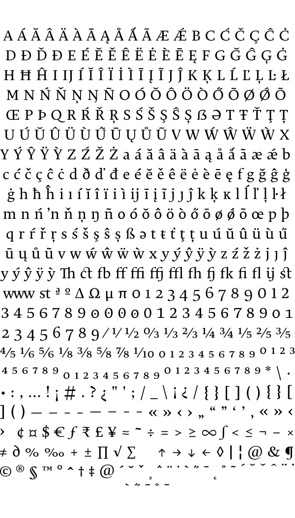
Of course, I am currently proudest of my latest child, Christel (named after my grandmother) because I think it is currently my most accomplished type family. Some of the weights are very lucid and open, having been design specifically for body text; this is reflected in the more generous width and the long extenders. The display styles have a totally different stroke contrast and are spaced a lot more closely. I did my first offset press test with it five months ago, having set a subcultural DIY magazine in Christel, and I was very happy with the result. In addition, I held a small presentation for Hermann Schmidt Publishers and managed to convince them, and editor Raban Ruddigkeit, to use the type family in the forthcoming book Freistil 5.
…
Get the Display Weight for free at myfonts.com
Buy Christel at myfonts.com
follow me at
Thank You.
Sascha.